Monday, 21 March 2016

Evaluation Task 1 (In what ways does your media product use, develop or challenge forms and conventions of real media products? i.e. of film openings)


Evaluation Task 1
In the 9 frames I have selected a number of different conventions are clearly used. From very first scene of the male showering the audience would probably assume that the opening will be set in a domestic environment. This is then further enforced in the scene of the male shaving where domestic items like towels are displayed in the background.

Camerawork and editing is also prevalent in the 9 frames. There is a wide variety of shots such as close ups, over the shoulder shots, low angle, mid shots and establishing shots. These combined make the opening a lot more aesthetically pleasing and interesting to watch for the audience. This is typical of an opening sequence as they usually have a variety of different shots and camera angles. The fact that the frames are black and white is clear evidence of editing also.

Throughout the opening different credits pop up at different times. For example the name of the producer, director and who stars in the opening. These credits are essential in that they inform the audience as to exactly who created what is happening in front of them and also gives those people credit. A notable point about these credits is the way they appear on the screen. Rather than suddenly appearing they slowly appear from blurry to clear and then dissolve out, giving them a ghostly, mysterious quality (especially relevant to the thriller genre.) This also applies to the title of the film which is displayed at the very end of the opening. Again the way it transitions onto the screen but also the style of the font create a sense of enigma around the opening.

By the end of the opening certain key aspects of the story are revealed, for example the main character is  shown to be the male who is being depicted throughout the opening, it's hard to imagine a film in which someone receives that much screen time yet doesn't feature as one of the main characters. In this sense it is typical of an opening sequence as the main character is given a lot of screen time and a lot of the focus is on him. The shot of the dead body at the end also reveals that this man is probably a serial killer and this then makes the audience question a number of things i.e why has he done this? Is this his house or the victim's house? Was there a motive? Therefore the story is perfectly set up as it can go in a number of directions from the end point of the opening.




Thursday, 17 March 2016

EVALUATION ACTIVITY - 7 (Giordano)

Looking back at your preliminary task (the continuity task), what do you feel you have learnt in the progression from it to full product?


EVALUATION ACTIVITY - 6 (Giordano)

What have you learnt about technologies from the process of constructing this product?

EVALUATION ACTIVITY - 5 (Giordano)

How did you attract/address your audience?

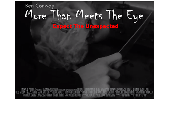
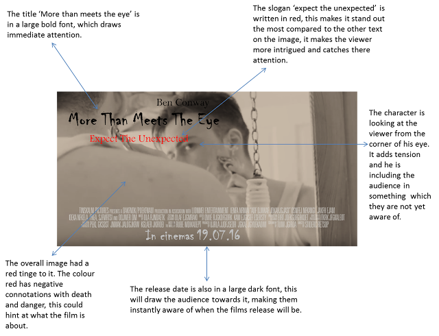
Real movie's will attract their audience via public advertisement, for example, trailers, merchandise and posters. Films with larger budgets usually spend a high amount of money on the distribution of their product. In my opinion I believe posters are the most effective as they positioned in places that are seen by almost anyone: buildings, train stations and the side of buses. Taking this into consideration, below are two movie poster's I have created for my marketing campaign.

Shown above are my two thriller posters that I have made. I decided to do some research into real movie posters and took ideas from the ones which interested me the most, and included them in my designs. I believe that both posters look professional, and if it were to be released as a full feature film the advertisement posters would look similar to the two I have created. 


Poster 2

  • The entirety of the poster is dark/black. The dark colours had connotations with death and mystery typical of the thriller genre. 
  • The close up of the knife also adds mystery and tension to the poster, as we as the viewers do not know what this person is capable of doing with that knife. 
  • The only light part of the shot is on the knife itself. This put a lot of attention on the knife and prioritises it.
  • The caption 'expect the unexpected' captures attention of the viewers. 
  • The font in which the title is written in provides a sinister feel. It looks as though it has been written in blood and has a smeared affect, i have seen many other thriller posters use a similar font. 
  • The character is not shown in the poster only his hand holding a knife. This adds further tension. 

When movies are distributed, they tend to have a number of different posters but the best one is usually the one the public see the most. Therefore I have decided to choose between the two posters. I think that my first poster would work best for the advertisement of our thriller. I say this because it follows more of the thriller conventions and i think it is more realistic and visually appealing. 

I believe that the advertising process (distribution) is essential in helping the word spread about films. This is because: It sykes them up to see the movie, catches public attention, helps to spread word of mouth and can result in people looking further into the film for example watching the trailer.   


Real movie posters that inspired my designs


They typical conventions of a thriller:
  • Low key lighting 
  • Quick cuts
  • Shadows 
  • Tense music
  • Changes in angle of shots 
  • Diegetic sound 
  • Protagonist and antagonist
The thriller genre has many conventions (shown above) and it would have been extremely difficult to include all of the above in the 2 minute time slot in which we were given to produce our thriller opening sequence. However our time slot was useful as it allowed us not to give to much away and
leave our thriller on a cliffhanger. 
                             

EVALUATION ACTIVITY - 4 (Giordano)

Who would be the audience for your media product?

I believe that out thriller opening sequence would appeal more to the younger demographic (15-25), than the older. Due to my previous research on film ratings, it is shown that a majority of thriller movies tend to be 15 rated, and young adults still tend to enjoy viewing them.


Looking at the table above, it is clear that the ratio of male to female is equal, 7 being male and 8 being female. Due to this I believe that our opening would appeal to both the male and female's younger demographic. 

Looking at my research,  I found out in my questionnaire that the thriller genre was popular and the majority of people were around the age of 15-20.  Furthermore to make the  thriller more realistic for example the use of the dead body and props are used to  convey the  thriller conventions, therefore we knew that we could not target the younger demographic. 

Questionnaire (audience research):


My group and I also thought that we should target this opening primarily towards males, as we have an all male cast. My focus group and interviews also pointed us in this direction. Looking at my questionnaire more males than females watch thriller movies, however there were more females then we originally anticipated. 

Interview with target audience (male)
                                                                         
yellow = male   blue =female


However, although I believe our opening will be appealing to older teenagers/Younger adults, I do not think it will be suitable for very young viewers (small children). This is because thriller movies tend to contain:
  • Violent and disturbing scenes
  • Tense scenes 
  • Loud build up of music
  • Shock scenes that make the audience jump
  • The story line may be too advanced to understand
  • Low key lighting can be scary to younger children 
  • Protagonist may scare a younger viewer (especially in our case)
Similarly, I do not think that our thriller opening would suit the older demographic. This is seen in my table above, only 2 people were over the age of 25. I believe the following conventions may not be appealing to them:
  • Violent and disturbing scenes  
  • Loud build up of music 
  • Some thrillers do tend to be very fast paced 
  • Shock scenes that make the audience jump
Taking all of this research into consideration I believe  (along with my group) that our thriller movie should be rated a 15, this is also made visible from my table above. A majority of people were 15/16 years old. Finally, our thriller movie also fits into the category of a 15 rated film (Shown below). My certificate research also helped me and my group to make this decision. 


Examples of our target audience 

Below are examples of what my target audience would typically be like, and the different characteristics of males and females. 


EVALUATION ACTIVITY - 3 (Giordano)

What kind of media institution might distribute your media product and why?


Sound cloud explaining who might distribute our thriller.
Above is my commentary regarding our thriller opening. I decided to speak about why my group and I decided to incorporate the use of logos and titles/credits. I also decided to research into real production companies and compared them to our opening of our film, and how we would be able to create an audience for our thriller.

Tiles and credits in order, from our opening 'More than meets the eye' 

Production logo

Distribution logo

Editing by.....

Produced by.....

Screenplay by

Tile 'More than meets the eye'

Music by.....

Cinematography by.....

Starring....

Directed by....


Mind map displaying how distributors gain an audience


EVALUATION ACTIVITY - 2 (Giordano)


Question 2 - How does your media product represent particular social groups?


Our thriller opening sequence shows a adult male aged between 18 - 25 years old, who at first seems to live a normal life with a successful job. We see this in the way that he is dressed in a smart suit and tie.

However what is kept at bay from the audience until the last few seconds of the opening, is that he is a psychotic killer.

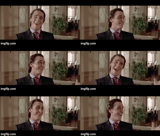
An evident character that our psychotic protagonist is similar to, is that of Patrick Bateman from American Psycho (Harron, 2000), particularly in their similar appearance (Made evident from the GIF's below)They are both young, male adults, alongside both having white skin tones and dark brown hair.

Looking at costume, both characters are dressed similarly (suits and ties, Business dress), giving the impression that again both character lead successful and normal lives. In 'American Psycho' Patrick Bateman by day is a head manager of a huge wall street firm, yet by night he unexpectedly work colleagues and street prostitutes, therefore being classed as a serial killer.

I believe that our protagonist is also very similar to this, at first glance you would think that he is a successful businessman yet as the narrative unfolds it is shown that he is a killer, this therefore sets up our protagonist to be the main role in our opening sequence.
 photo More_Than_Meets_The_Eye_Final_Edit_AS_Media_Group_1_zpsmulu09ra.gif
Our Protagonist

Patrick Bateman (American Psycho, Harron 2000)


Furthermore, we also decided to change the predictable victim of a serial killer, which in most thrillers tend to be a venerable woman. In our case we decided to use a black male to play the part of the killers victim. Usually we expect to see black males fighting their way through the films and or tend to be presented as criminals and law breakers dressed in tracksuits and hoodies tops, especially in the thriller genre. Examples of this include, The purge and training day (see examples below).


The purge character (stereotype black male)


Training day character (stereotype black male)


Female victim stereotype (The call)


The different representations are portrayed in four key areas, these are - angles and movements, mise en scene, editing and sound, camera shots.
Camera shots:

Our thriller opening also uses a variety of different camera angle shots. An example of this is towards the end of the opening, when we see a low angle shot of the protagonist looking down at what we later find out is a dead body. Low angle shots are used to show his power in the opening. Sharply contrasting this is when the camera tilts down towards the floor to reveal a dead black male. This shows his lack of power and is nothing compared to the protagonist in this scene.

Mise En Scene:

Mise En Scene plays a huge part in our thriller opening. The costume in which we decided our protagonist to wear (a suit) suggests to the audience that he is of upper or middle class. Props also plays a key part in our opening. The watch in which the protagonist outs on his wrist also symbolises his class and perhaps wealth.

Editing:

When it came to the editing of our opening sequence, we put all of our footage together and it was five minutes in length which was far to long. We therefore had to cut out certain scenes and extend others, an example of this is the shaving scene. The fact that we edited the entirety of the opening to be in black and white, and also an eerie piano score playing over the opening, the simple shaving scene is looked at different and is very tense and unsettling.

Sound:

For sound, we decided as a group to use a dark and eerie piano score, to create a tense and mysterious fell throughout the opening. I think that the slow piano score almost compliments the back and white effect used throughout the opening.


EVALUATION ACTIVITY - 1 (Giordano)

In what ways does your media product use, develop or challenge forms and conventions of real media products?


Frame 1 - Production Logo
Frame 2 - The protagonist showering
Frame 3 - Extreme close up of protagonist apply shaving foam
Frame 4 - Close up of protagonist aggressively shaving
Frame 5 - Close up of protagonist handling a large bread knife
Frame 6 - Close up of protagonist aggressively eating
Frame 7 - Slow motion, high angle, close up of protagonist mysteriously smiling
Frame 8 - Extreme close up of the dead mans eye
Frame 9 - Title 'More than meets the eye' fades onto a black screen.

In this 9 frame analysis I have selected different conventions that are clearly used in our opening.

Below I have made a detailed soundcloud audio of each 9 frame image.

Evaluation Task 2 (How does your media product represent particular social groups?)

Evaluation Task 2

In our thriller opening we present a young man aged between 18-25 who seems to be living a normal life and appears to be successful in that he wears a smart suit and nice watch and is generally presented as a successful professional. However what the audience don't realise until the very end of the opening is that he is also a psychotic serial killer.

 One character to whom our psycho killer can be compared to is the character of 'Patrick Bateman' from the film 'American Psycho' (Harron, 2000). On IMDb he's described as 'a serial killer who murders a variety of people, from colleagues to several prostitutes' despite the fact that he is also the head of a major Wall Street firm. In terms of the appearance there are similarities that can be drawn between the two characters. Both are young, white males with dark hair. In terms of costume, as previously mentioned they are also similar in that they are dressed in business attire. In terms of role, if we had made a full length film the character presented would have certainly
played a major role, if not probably the main role,
as does the character of Bateman in 'American Psycho'.


Additionally we subverted the stereotypical victim of a serial killer by using a young black male, rather than for example a young, white female. In most films young black males are usually presented as wearing hoodies and are often law breakers and tend to have dominant roles within films however in our opening the character is presented as completely powerless (as he is dead.)


Stereotypical female victim within a thriller --->


Stereotypical young black male presentation--->


We created these representations through the use of the four technical codes: mise en scene, camera shots, angles and movements, editing and sound.

In terms of mise en scene, especially in relation to costume we displayed the white male as being middle/upper class through him wearing a suit. In terms of props the watch he puts on also suggests he is a middle/upper class working professional. The fact that he is the only character that appears in the opening until the final moments when the dead body is revealed suggests that he is the protagonist of the film.

Camera angle wise there are a number of shots which display the white male's dominance for example the low angle shot displayed above in which he is shown to be looking down at the dead body. This clearly reveals his power and high status within the film opening. In contrast the close up shot of the black male showing his motionless face reveals the lack of power he has.

In terms of sound we use a slow, mysterious sounding piano piece which plays throughout. The fact that we use a piano piece reflects the middle/upper class profile of our male protagonist.

When editing our opening we cut various scenes down and added the music over the top. There are a number of scenes which last for a prolonged amount of time, for example the shaving scene in which a sense of calmness is established however there is a slight edge due to the fact that it's in black and white (which we added in during editing.)


Wednesday, 16 March 2016

Evaluation Task 7

Evaluation Activity 7

Looking back at your preliminary task (the continuity editing task), what do you feel you have learnt in the progression from it to the full product?


Pre-Production

This phase of production had a lot less time spent on it, as we simply only had a short period of time to draw up our project. This resulted in more last minute tweaks in the production stage when we should've just been filming. In each task we planned our location, storyline and a rough script however the thriller opening was more in depth and professionally conducted, which in my opinion was a great reason why this production ended up running more smoothly.


In contrast to the preparation of our preliminary production for our thriller opening we created storyboards, conducted research into production and mini pitches of which we shared amongst our group. Collectively we comprised an overall pitch which was presented to the class. 


The presentation of which was key in the development of our final product as the class pitch brought with it scrutiny over our idea for the thriller we originally wanted to produce. The original plan was to create a crime thriller about a young boy growing up around drugs and gang culture however the concern for our group that came back to us from feedback was that it was more of a social realist film as appose to an actual thriller. Not only this but it was heavily picked up on how this was a common premise amongst independent filmmakers especially in London, with similar productions such as Kidulthood and Adulthood respectively.

We heeded the constructive criticism and decided to go ahead with planning out the thriller opening going in a different direction.
Once we had our updated thriller ideas ready we presented them to potential audiences in order to gain feedback.

We conducted research into production company's and into determining who our key demographic would be be making questionnaires and analysing age rating of similar media products.
Once we had shared our ideas and had a collective direction of how the thriller would pan out we created a storyboard to plot out the production scene by scene.


Production

In the production stage of our tasks we shot all the scenes that we had envisaged in pre production.
During the shooting of the preliminary production we made sure to capture the desired camera shots that were needed to adhere to the criteria we had been presented with which included the 180 degree rule, match on action and shot/reverse shot.

180 Degree Rule
Match on Action


Shot/Reverse shot


We had learnt from our preliminary task that we required a more suitable location and a domestic location proved to be a great environment to shoot a psychological thriller.
In the thriller opening we started shooting chronologically to how we had written the production in the pre-production phase, beginning with the establishing shot in the shower and ending in the hallway with the dead body.


In our domestic location we didn't require any artificial light, the light that lit our Mise en scene was all natural, coming from windows and through open doors of the opened planned living environment.


The domestic setting also presented us with plausible props that we used throughout our production such as the razor and the carving knife, which we used effectively to create tension as we used them in close-ups dwelling on the action as means to linger which put the audience at an uneasy disposition.


Post - Production

In the post production stage we conducted editing. For this we used Final cut pro to comprise our footage together. In this stage we also added titles, credits and audio.


Upon reflection of both films that we created it is apparent that we were more concise and aware of risk within our final piece as appose to our preliminary film...


To the left in these screen grabs we can see issues that occurred during production and that weren't eradicated in pre - production, however they are direct results of the problematic location.

The first image shows a shadow which is of a crew member who wasn't meant to be in the shot as a our protagonist can be seen entering the shot as he opens the door.

In the second image a collection of both cast and crew were accidentally featured in the shot as they are seen in the distance behind the bench and in the reflection of the windows.

There was a third issue that diminished the quality of our product, the problematic location lead to there being strong diegetic sounds coming from planes flying above, our location being right near a runway wasn't helpful yet seeing that we had to shoot on-sight it was almost unavoidable.


We improved the appearance of text with our second production. The preliminary task featured basic text with a blank bank background whilst in the thriller opening we were able to add text at the forefront of our Mise en scene. For example the film's title was featured amidst the close-up of the protagonist's watch.


Before posting our full thriller we posted a rough cut in order to see how not only we viewed our production but to also get considerable feedback from audiences. We received mainly extremely feedback from consumers however it was pointed out as to certain subtleties that lessened the overall quality of our production such as the establishing scene, where the camera was originally jittery however this was soon resolved and the cleaner finish can be seen in the full product of which we posted later.


Reflection

Upon the completion of both productions i feel that i have learnt a lot from the first to the second, between the preliminary and the thriller opening. I have realised that to create a film that i'm satisfied with it takes careful planning and patience as well as being comfortable with all the components that are utilised in the creation of the production including technologies such as the camera and editing  programmes such as Final Cut Pro.


Evaluation Task 6

Evaluation Task 6
What have you learnt about technologies from the process of constructing this product?


During the course of production and construction of our product we have been introduced to new resources that we were able to become accustom to and comfortable with using. Through the processes of pre production, production and post production we unearthed both benefits from the technologies


Evaluation Task 5

Evaluation Task 5
How did you attract/ address your audience?

With our production there was a number of ways in which we found that we could attract and address our audience which included...

Character
Audio
Title and Texts
Conventions of a Thriller
Advertising Campaign


The Protagonist is a young male of which is a relatable factor for potential customers as our target audience is of the same demographic.
The male may attract other  young men as they can identify with him and he may also attract female audiences as they may simply be attracted by him, this technique has been used by nearly every film ever made, notably films such as Twilight have amassed a cult following from young girls who fancy the main protagonist, in this case Edward Cullen played by Robert Pattinson.

The audio of which is non-diegetic and plays throughout our thriller opening is effective at creating suspense and thus keeping the audience intrigued as they may not otherwise, considering that the re is no dialogue throughout the opening.

Texts and titles were used effectively in the production addressing who was involved in the creation of the product, crediting crew as well as cast and directors. Also the film's title is featured amidst the production addressing the audience.


In our production we also feature conventions/elements of a thriller including

- Crime
- Complex narrative with false paths
- Themes of identity
- Themes of mirroring
- Tension
- Villain
-Twists/Red Herrings 


Advertising Campaign

For Any film looking to gain recognition before its release a successful advertising campaign is key.
The bigger productions which have more capital behind them often have a range of avenues in which to outlet their product, for example films like The Revenant (2015, Inarritu) or Spectre (2015, Mendes).

Trailers


The film trailer is great tool for introducing a film to its audience, it is however rare for an independent film to be have its trailers featured during ad breaks as it is expensive to acquire this which is why audiences only tend to see mainstream productions as independent movies are harder to find out about and are more easily missed, for example to see an independent film trailer you will usually have to come across it via social media sites, in particularly Youtube or through film sites such as IMDb. Sites such as Youtube are great for films as they supply less known productions with a platform for free advertising in means for a film to reach their audience.

Film Billboard

Billboards are one of the oldest forms of advertisement for film, billboards feature posters promoting productions, they tend to host bigger productions with a lot of money behind them as billboards aren't cheap to acquire.

Updated Film Poster

This is an updated film poster for The Revenant released after award season to convey how successfully the film has already been received by audiences.

The poster features two highly recognised cast members, Leonardo Di Caprio and Tom Hardy who are pull factors for the production as the two stars have a fan base and will draw these consumers in to see the Revenant also. The poster features ratings from news sources and performance stats at award ceremonies such as the Baftas, Golden Globes and Oscars.


Television Spots

To the left is a clip showing Revenant Star Leonardo Di Caprio being interviewed by talk show host Ellen Degeneres about his latest project. The interview was aired at a key time as it was just after the film's release and whilst the film was showing in theatres thus creating recognition and even demand as it is noted that audiences will go to see Di Caprio films.


As we are responsible for an independent production we have to find alternative ways to market our product to an audience.
Fortunately our demographic are heavy users of social media, of which is a commonly used tool to advertise productions, both for mainstream and independent film.


I devised some mock ventures to visualise what our films advertising campaign may theoretically look like.

Twitter page...


      Two Alternative film posters