
20th century Fox is most likely the most known production company and also obtains one of the most recognisable logos of all the companies. I really like the use of bright colours in the logo, it is appealing to all age groups, normally light ad bright colours would mainly appeal to the younger demographic however these colours are subtle and blend well together. Also, the logo is simple there is not too much going on. This is good as the logo only appears on screen for a short amount of time, and you do not want to show the audience too much going on in one image as they may not pay attention to it.

Metro Goldwyn Mayer is also a very recognisable production company again I believe this is due to their simple yet appealing logo. I also believe that the sound used in the logo (the lion roaring), differentiates this logo from others. Normally production logos just flash up on screen and audience members do no pay attention, however if audio is added it makes it more appealing and interesting, it will intrigue audience members.

Although Focus Features was the production company for huge films such as 'Kingsman The Secret Service', in my opinion the logo is not original or different in anyway. I prefer logos that have images that incorporate text not only text on a colorful screen. If I were to see this on screen most likely I would take no notice of it as all I see it as is text on screen. The only thing that is infact eye-catching is the multi coloured background, I believe this is effective and look to incorporate something like this in my own logo when I come to make it.
A good logo is distinctive, appropriate, practical and simple. A great logo essentially has to have great concept and great execution. Simplicity makes a logo design easily recognizable, versatile and memorable. Good logos feature something unexpected or unique, without being overdrawn. Another key to making a great logo is memorability. An effective logo design should be memorable, which is achieved by keeping it simple yet appropriate and appealing.
Below I have experimented making logos for our production company logo, later I will present my ideas to my group and we will decide on a final design fit for use.
 |
 |

My third Idea I produced is my favorite for the following reasons. Firstly, it looks the most professional and looks as though it could be at the beginning of a feature film. Secondly, the image of an old castle creates a sinister and eerie atmosphere which are common aspects of the thriller genre.

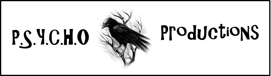
Finally I created this logo. I like this Logo as it is predominantly dark and creates a sinister and eerie feeling when I look at it. I have asked some people who watched thriller movies and they have said they could imagine this logo appearing at the beginning of a thriller movie. Therefore I believe this logo was successful.
Audience Feedback:
Person 1 (John,17): He said that he liked all of the logo's and that they fit my genre of film (Thriller) very well. His one criticism was that they all follow a similar pattern, which is black and white with standard font. He also said that they all have connotations with the thriller genre and if this were to be a real production company this would not be the case. His favorite logo was logo 4, as it was simple yet effective, it also created a eerie mood.
Person 2 (Alex,15): He said that he liked all of the logos apart from logo 1. He thought that it looked unprofessional compared to the other three logos. He said that the red colour used contrasted far too much with the white back group and that he could not imagine seeing this logo appear on a full feature film. He also said that his favorite logo was logo 3 as the name has many connotations with the thriller genre, he also liked its simplicity.
No comments:
Post a Comment